
BY VALERIE HAWLEY

JENNIE MARSH CONSULTING
DEFINING A BRAND AROUND CLARITY, TRUST & STRATEGIC GUIDANCE
Developed a comprehensive brand and website strategy that clarified service positioning, refined messaging, established a cohesive visual identity, and translated complex consulting services into language that resonated more clearly with clients and organizational leaders.
THE CHALLENGE
Jennie Marsh Consulting needed more than a visual redesign. While the organization offered deep expertise in leadership, facilitation, strategic planning, and organizational development, the brand and website did not clearly communicate what made the work different or why clients should engage.
One of the primary challenges was positioning. Traditional consulting and strategic planning language often felt too corporate, vague, or disconnected from how clients actually described their needs. Potential clients were often looking for clarity, guidance, collaboration, leadership support, and organizational alignment — not necessarily “consulting.”
At the same time, the existing brand lacked a cohesive visual identity and messaging framework capable of supporting long-term growth and differentiation.
The goal became creating a brand experience that felt approachable, strategic, collaborative, and human-centered while more clearly communicating Jennie’s expertise and leadership style.
BRAND STRATEGY & IDENTITY DEVELOPMENT
The work began by defining the core identity of the brand — not simply what services were offered, but how Jennie’s approach, personality, and leadership style should be experienced visually and verbally.
The strategy process focused on:
Brand positioning and differentiation
Audience perceptions and decision-making behaviors
Service clarity and messaging hierarchy
Tone of voice and communication style
Visual identity development
Website structure and user experience
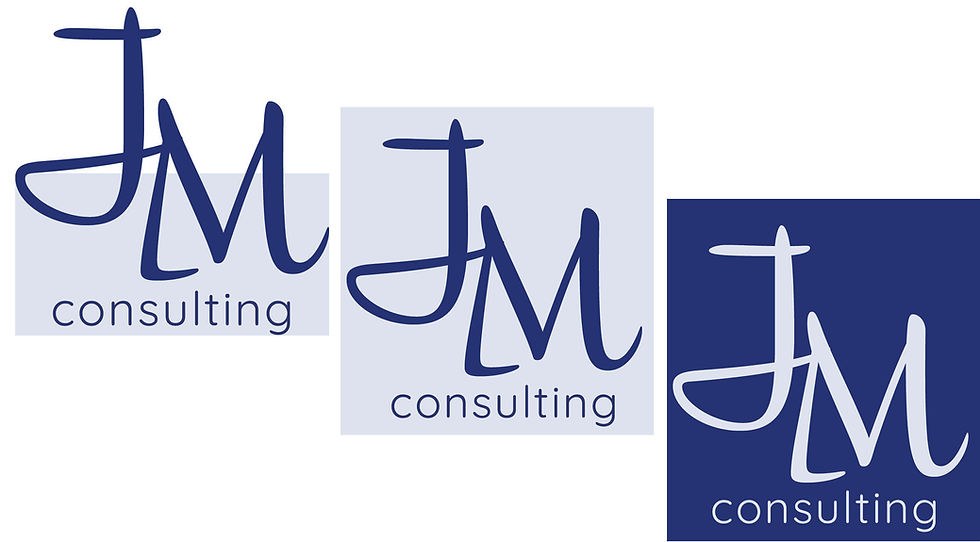
Use of Monogram
The logo was intentionally built around Jennie’s name and initials because her reputation, relationships, and credibility are already central to her brand. The oversized handwritten-style “JM” monogram creates a recognizable signature mark that feels personal, confident, and memorable — reinforcing that clients are hiring Jennie herself for her expertise, leadership, and guidance.

Typography & Structure
The contrast between the expressive monogram and the clean, modern typography reflects the duality of her work:
-
Strategic and organized
-
Collaborative and human-centered
The structure of the typography communicates professionalism, clarity, and thoughtful planning, while the flowing monogram introduces movement, adaptability, and approachability. Together, they create a visual identity that feels:
-
Strong but not rigid
-
Professional but still personal
-
Creative without losing credibility

Colors
The color palette was intentionally designed to balance professionalism, trust, and strategic clarity with warmth, calmness, and approachability. Deep blue tones reinforce credibility and leadership, while soft neutrals and muted teals create a grounded, collaborative feel that reflects Jennie’s thoughtful, human-centered approach. Brighter accent colors were used sparingly to introduce energy, growth, and optimism without losing the brand’s calm and sophisticated identity.

MESSAGING, TONE & WEBSITE TRANSFORMATION
Once the foundational brand identity was established, the work expanded into redefining the organization’s messaging, tone, and digital experience.
Rather than relying heavily on traditional consulting language, messaging was rewritten to better reflect how clients actually describe their challenges and goals. Service descriptions, calls-to-action, and website copy were restructured using more approachable, client-centered language focused on clarity, facilitation, leadership, collaboration, and organizational support.
The website redesign focused on:
-
Clarifying services and expertise
-
Improving navigation and user experience
-
Creating a more human-centered tone
-
Simplifying complex consulting language
-
Strengthening visual consistency
-
Better reflecting Jennie’s leadership and facilitation style
The result was a more cohesive brand and website experience that aligned visual identity, messaging, and strategy into a clearer and more recognizable client experience.
Impact
The project translated complex strategic consulting work into a brand experience that felt approachable, credible, collaborative, and authentic to the way Jennie works with organizations and leaders.

