BY VALERIE HAWLEY

BLUE VALLEY CAREERREADY +
OVERLAND PARK FIRE DEPARTMENT PARTNERSHIP
BUILDING A UNIFIED CAREER READY FIRE & MEDICAL PROGRAM IDENTITY
UNIFIED
TWO DISTINCT ORGANIZATIONAL BRANDS INTO ONE STUDENT-CENTERED IDENTITY
TRANSFORMED
EARNING ENVIRONMENT INTO A MORE MODERN, ENGAGING EXPERIENCE
THE CHALLENGE
The Overland Park Fire Department partnered with Blue Valley School District’s CareerReady program to create a student pathway focused on fire and medical training.
The program needed a cohesive visual identity that represented both organizations equally while creating something engaging and recognizable for students. The challenge was balancing two established brands and cultures into a unified system that still felt authentic to
both.
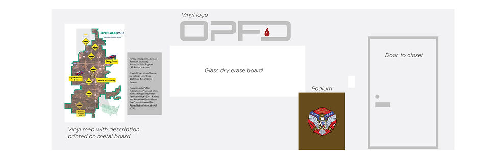
The initiative also extended beyond logo development into the physical classroom environment, where the goal was to create a more modern, branded learning space aligned with the program’s mission and the architecture of the facility.
BRAND STRATEGY & VISUAL IDENTITY
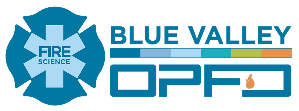
After meeting with program and department leaders to better understand the vision, audience, and culture of the partnership, multiple identity concepts were developed to explore different ways to visually connect the Blue Valley CareerReady program with the Overland Park Fire Department. The visual system was designed to bridge education and public safety through a modern, flexible identity that balanced the distinct qualities of both organizations while maintaining recognition of the existing CareerReady brand.
The colorful CareerReady bar system became the primary connective element, helping visually unify the partnership across applications and materials. Public safety symbolism — including the Maltese cross and Star of Life — was incorporated to clearly represent fire and medical training pathways while maintaining a clean, student-focused aesthetic. Through a collaborative review process, the final direction was selected and refined into a cohesive identity system that could extend across apparel, environmental branding, and future program materials.



APPLICATION & IMPLEMENTATION
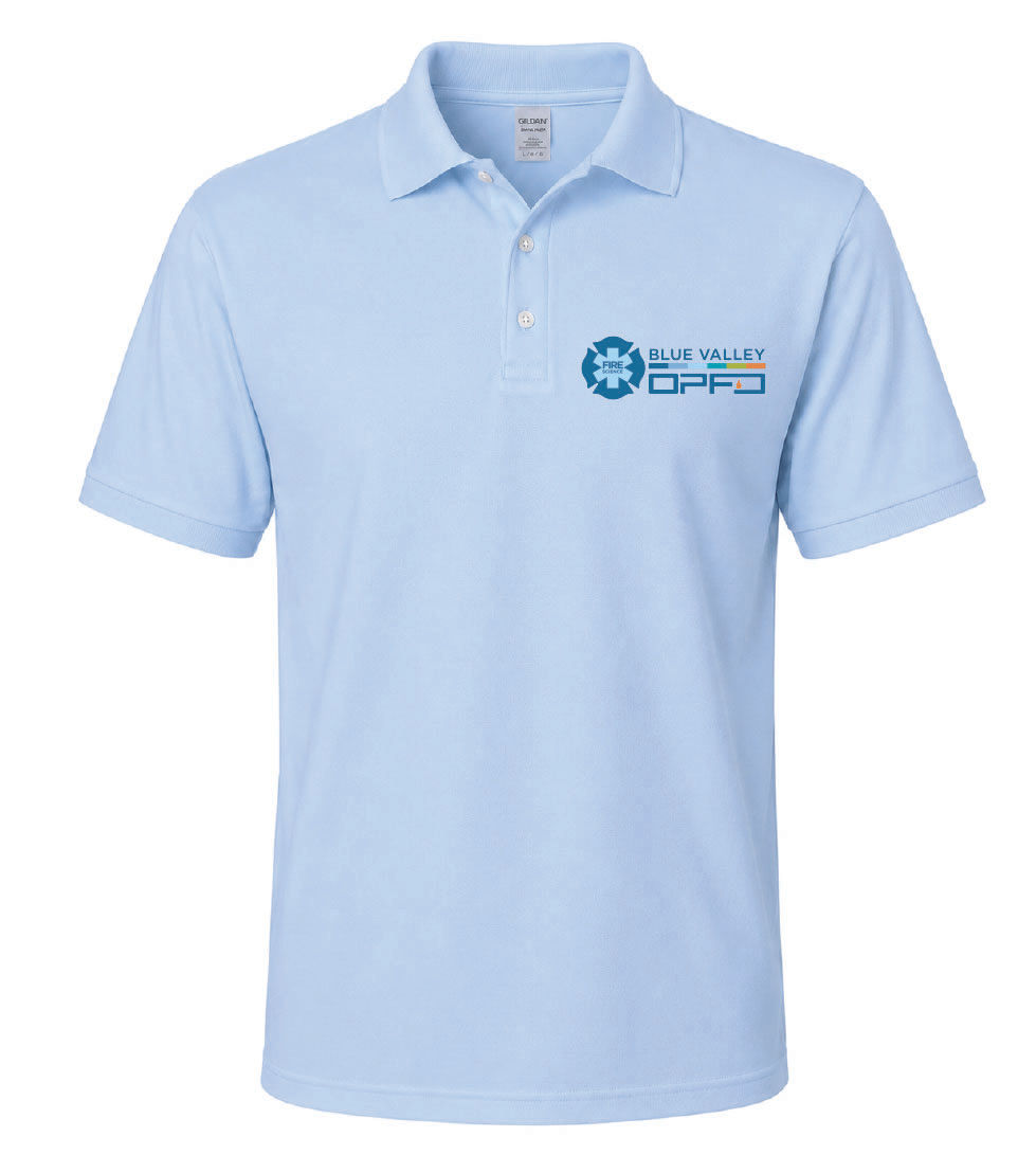
After the final direction was selected, the identity system was extended into apparel and environmental applications, including student T-shirts, sweatshirts, and classroom branding elements designed to reinforce program identity and student belonging.


ENVIRONMENTAL DESIGN & CLASSROOM REFRESH
The project expanded into redesign recommendations for the classroom environment to create a more cohesive and engaging student experience. Design direction intentionally reflected the building’s industrial materials and architectural character — incorporating metal, glass, bold graphics, and the newly developed branding system to create a space that felt modern, professional, and connected to the fire and medical industries.